Flashback (Memoryzone) Landing Page
Design layout and illustration exploration to improve the conversion rate of USB plugins on the landing page through feedback.
We noticed a drop off when users were requested to plug in their USB drive after downloading the Flashback web app.
What is flashback used for?

The flashback product provides cloud backup for new and existing customers with the Sandisk ultra and ultra-fit drive. It is one of Western Digital's diverse products that integrate software and hardware to meet the demand for backup and centralization of data stored in multiple locations.
Image showcasing how flashback should be plugged in
THE PROBLEM
Flashback as a service was geared towards providing cloud back up for USB. It helps you access, share, and backup content on your USB regardless of the location. The major use cases are situations where you have to share confidential data that you don't want to lose by virtue of having them on a very small USB stick


MY ROLE
My role was to redesign the landing page by exploring different illustrations and call to action copy.
I started by going back to my previous analysis on the flashback landing page and also worked with our researcher Shanmeng to understand how and why people used the app. I first identified their behavior and perception of the current landing page and those findings with usability testing.
The approach was to find out where and why users dropped off and change one thing at a time on the landing page.
HIGH LEVEL TIMELINE
I had 2 week Sprints.
The goal was to make a very quick change to the illustration.
MAKE OF THE TEAM
Chidinma Kalu, Lead Designer, Zareena Anwar Project Lead, and Shanmeng Liu,
KEY GOAL
The Goal was to improve landing page and USB plug-in conversion from to 70%
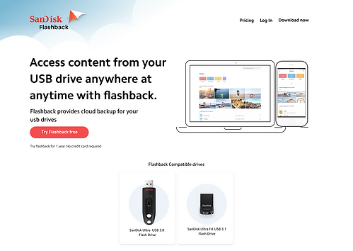
The current flashback landing page
BREAKING DOWN THE PROCESS
I followed a lean process that capitalized on preliminary research, analytics. The bulk of my time was spent on sketching and prototyping solutions derived from the research, analytics, and hunches.
The first step was to understand the problem and test , I conducted a quick heuristic evaluation, a series of mind maps and then design exploration Research
-
Validate Research
-
Heuristic Evaluation
-
Competitive analysis
-
User flow
-
Mind Maps
-
Layout Explorations
-
Illustration and sketches
-
Prototyping
UNDERSTANDING THE USER
I reached out to our researcher to find out the reason for the drop off rates we had experienced in my previous analysis
Through user research, diary studies, and analytics, we were able to identify why users didn't plug in their USBs, how they perceived the landing page. The research plan included revisiting analytics, a usability test of the landing page to understand how users land on the download page and how much time users spent from account creation to account confirmation.

Analytics showing drop off rates
User Flow of the landing page
The goal of our project was to improve our USB plug-in conversion rate to 70%
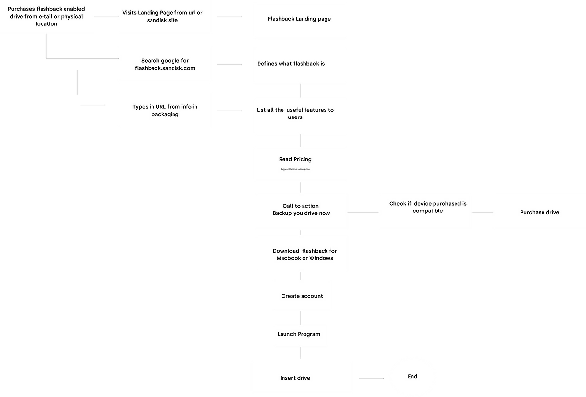
Diagram showcasing idea user flow from funnel on to USB plugin
Tester feedback
Landing page
*One tester said she would not try the free trial without seeing the price while another tester wondered how much storage he could have and also the pricing.
Users didn't feel they have a need for the cloud back up because they already have space on their USB.
Pricing and how to move forward
*"I don't know whether Flashback memory is limited to just the USB drive."*
Pricing is not communicated in a way users can make decisions right away.
Product usefulness
One tester had questions about features when he was starring at the top.
*
People did not understand the feature of being able to restore lost items from their drive to the cloud in the future.
Heuristic Evaluation
My Visual Observations
-
The text size seemed small
-
The SanDisk logo needs to match the product
-
Flashback should be tied to the Sandisk website
-
The action button needs to be larger
-
Product placement should be larger and show the users how to connect their devices
-
More information about how to the product works like how to connect the device and testimonials
-
A clearer indication for the download button for windows and Mac.

Competitive Analysis
I looked at different landing pages that I felt were visually pleasing like the apple product landing pages, dropbox, portal, google photos and dropbox.
My takeaways were that showcasing the product on a high level could be done in abstract or in see-say. All the landing pages have consistent colors with white and an emphasis on the call to actions.

Competitive Analysis
Abstract
The abstract landing pages had bold headlines and animated graphics.
The interesting landing pages were minimal, they use a grid to line up things and whitespace to focus. The illustrations were minimal and interactive for a few
See-Say
The landing pages that are see-day have bold graphics and very crisp photography of the product being sold, including very detailed descriptions of the features and how it workss.
Next, I looked at the different layouts used and began exploration of layouts and copy .
.png)
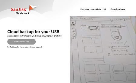
Option 1 : Grid layout with text on the left and image on the right

Option 2: Grids with centered text, CTA, and images
Explorations
I decided to explore both options
During the exploration phase, I kept asking why we needed to redesign the page and to make sure that we were making the right decision to change the website which would lead to a clearer understanding of the landing page for our customers.
As a team, my manager and the project owner felt strongly that the illustration needed to change and that something more animated or high level will be more suited for the site.
Copy writing
Another area I proposed to change was the copy, The initial copy was "Cloud backup for your USB" . Flashback enables you to access your content anywhere.
.png)
First copy
.png)
Second copy:
Illustration explorations
Developing visual representation of flashback through mind maps and phrases
I started by asking people what they felt when taught about the service we provided. I also create a visual mind map that associated words and key phrases with visuals. I wrote down all the visuals I could think of that had a connection to things like losing your money and getting it back. I started to generate visual that resonated well with the service of flashback

White boarding brain storm session for symbolic visuals
-
Hands in the Cloud with a USB (USB in your hands to the cloud )
-
A man riding a bicycle in a scenic place(Go anywhere and do anything)
-
No need to check your pocket ( Safety)
-
Everything in place ( Cloud connection)
-
Piece of mind ( Meditation)
-
Lighting speed transfer (Rocket USB)
-
Plug in your USB to upload to cloud -See Say
-
Rocket USB launching to the cloud
Take aways


Freehand sketches for the landing page from the exploration phase
MAKING A CHOICE

Option 1
Option 2

Option 3
Hi-fi Digital explorations
Out of many illustrations I selected one abstract and one see say illustration to create graphics for using figma and also created another using
-
Piece of mind ( Meditation)
-
Lighting speed transfer (Rocket USB)
-
Plug in your USB to upload to cloud -See Say
-
Rocket USB launching to the cloud
I experimented with the copy find strong lead words that communicated the goal of the landing page
I chose to keep illustration but add the devices to show the users what product will be connected to the site .

Follow up call to action buttons
.png)
Woman meditating in lotus pose with content revolving
I placed the logo to align the SanDisk brand with the flashback product
I chose this illustration because I serenity and meditation came to me because of the visual people have about peace of mind and. I asked 5 testers how this image made them feel without the copy
MAJOR LEARNINGS AND SALES FUNNEL IMPROVEMENTS
I realized the drop off on the landing page happened because of the lack of connection between the Sandisk brand recognition and disconnection between the hardware funnel and software. I suggest that we could retain customers by converting them through a funnel. This could have been improved from social media, e-commerce platform funneling to the software landing page.

